


Designs Per Click, Comment Quality Ratio and More Design Team Metrics
How to know whether your design team makes everyone's job harder.

In my early time at a previous role, we went through a phase of wanting designers to maintain their own backlog, calculate story points for design tasks, the works. Senior management wanted more visibility into why some design work took longer and how productive designers actually were. I was asked to get the team on board with this initiative.
I can tell you in hindsight that it was a fruitless exercise. The design team isn’t meant to stand and operate on its own. Later, once we had a functioning EPD trio in a single squad, the momentum we built was great. We devoured user stories like an Asian aunty at a buffet line—both output and outcomes were met, and no one thought about measuring work done ever again.
The exercise of trying to measure efficiency in isolation was itself a form of busywork. After all that, I don’t think anyone could even remember it happened.
Measuring efficiency of actions
In gaming, there’s a distinction between APM (Actions Per Minute) and EPM (Effective Actions Per Minute). You can click frantically and accomplish nothing, or make fewer, more deliberate moves that win games. Design work has the same dynamic.
The more actions you perform doesn’t mean you’re actually efficient, nor getting the right outcomes. The old cliché goes: movement alone does not equal progress. In a team context, busywork does not mean work is getting done.
But while teams would certainly like more frameworks and processes to measure efficacy, here are the metrics I dream of that might make tracking design team performance actually useful and actionable.
There’s plenty of content out there about how to make better UI choices, use specific tools to be more productive in design etc, so I won’t add to that. But the following are currently unquantifiable product design performance metrics and, maybe, unspoken things people don’t openly admit.
We have AI features in Figma now, it wouldn’t surprise me if LLMs can start logging actions and analyse version histories, and you can receive a report of which designer on your team you can optimise, or have the AI tell you whose Figma seat you should revoke effective immediately.

I had some of these ideas floating in my mind for a while, but reading
’s Lies per Second, Meetings per Decision Ratio helped solidify and inspire the rest.If you can’t tell yet, this is conceptual and for fun. But it’s also very much grounded in real-life events and irrational pet peeves.
1. Designs per Click (DPC)
What it measures: The ratio of meaningful design progression to total mouse clicks and keyboard shortcuts executed on a file.
The reality: Have I completed one component design in 10 moves, or have I moved the same element by 1 pixel 10 times? Similar to APM vs EPM, it’s about meaningful progression versus busywork.
High DPC indicators:
Designing with real data from the start
Using established patterns from your design system
Making deliberate decisions rather than endless micro-adjustments
What high DPC means: You’re working with purpose. When designers have clarity on requirements and access to real content, they make fewer arbitrary decisions and waste less time on pixel-pushing theatre.
2. Net Engineer Score (NES)
What it measures: Like NPS, but for the happiness of engineers relative to the quality of your design handoffs and files.

The reality: This is about whether your design work makes everyone else’s job easier or harder. Can engineers start work immediately when the cycle begins because everything has been considered and de-risked? Or are we going to waste a day because we have to wait for (forgotten) state management designs that were crucial to a core user flow?
The measurement: “Did this design handoff make your life easier or harder?” followed by specific feedback about what worked or created friction.
What matters:
Edge cases you’ve designed for versus clarifying questions they need to ask
Component usage that aligns with the existing system
Clear annotations for interactive states and error handling
I secretly find it more fulfilling when an engineer says “that was the best handoff ever” compared to seeing increased feature adoption. It feeds my insatiable designer insecurity much faster than lagging indicators of product growth.
3. File Organisation Ratio (FOR)
What it measures: The ratio of auto-layout containers to frames to grouped elements in your design files. (AL:F:G)
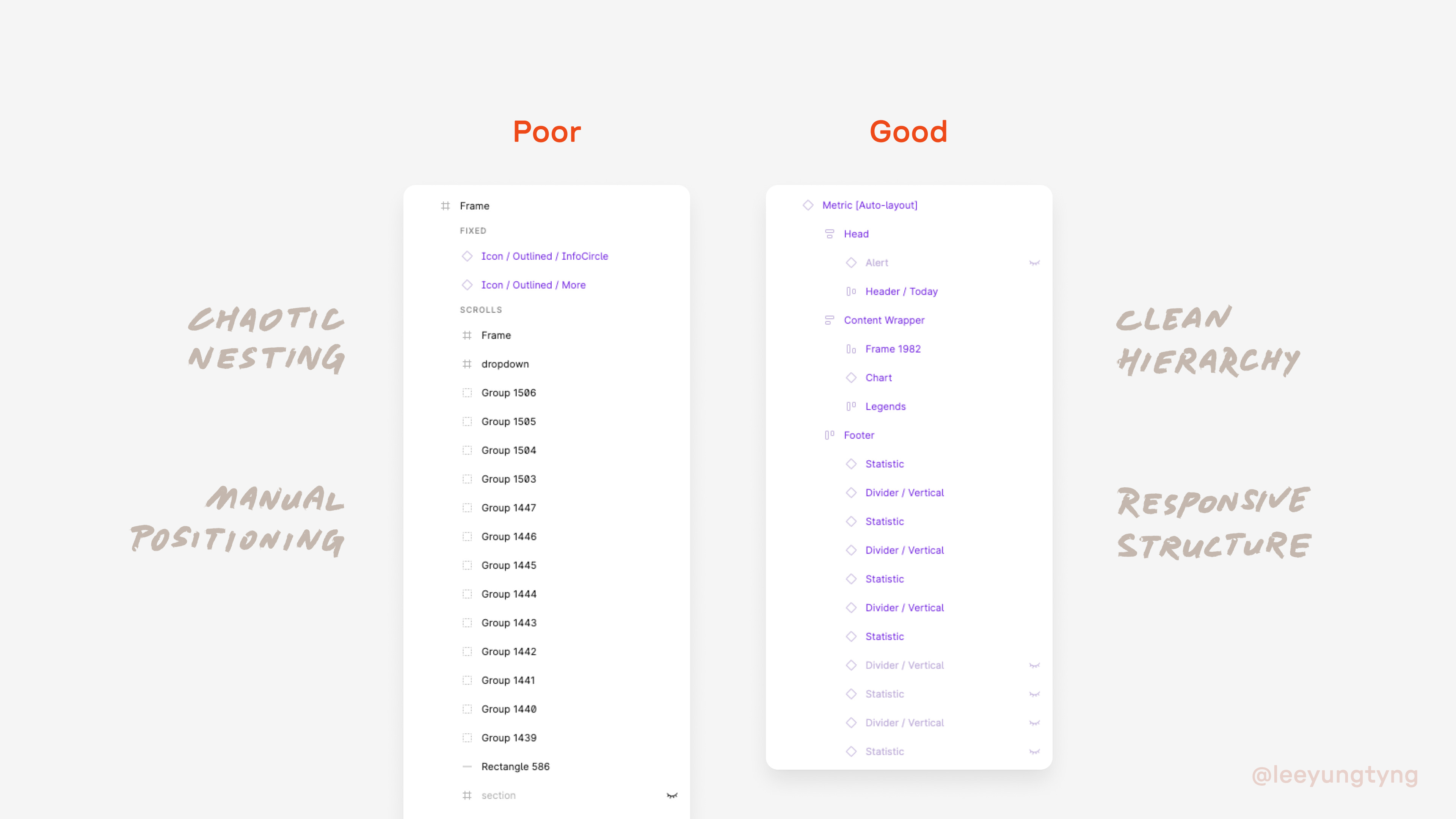
The reality: I’ve had to take over projects where I end up wading through 1:2:10 type of files and it’s utterly draining. Everything’s manually positioned like the old Sketch/pre-2018 Figma days—no defined padding or gutters, just components dragged and dropped into place. Random frames used for sections, and elements grouped together that should be proper containers. I’ve resorted to rebuilding entire files like these, simply because it was way faster than fixing.
I know designers who would argue “I work faster this way” or “done is better than perfect.” But the point is, just like code hygiene, file hygiene helps engineers get the right specs too, so it’s not just about personal working style. It’s sad if we don’t learn to work cleanly from the start, just because we’re used to an old way of doing things.
The ideal ratio: Something closer to 10:2:1. Everything’s nicely set up in auto-layout, mostly responsive. Frames are used deliberately for images, groups are used for vector elements that genuinely need to stay together as a unit.
Why this matters: File organisation directly impacts handoff quality and team collaboration. When designers leave behind organised, logical files, the next person (including future you) can actually understand and build on the work.
4. Rate of Reviews (ROR)
What it measures: How frequently team members see your work in progress before you present final designs.
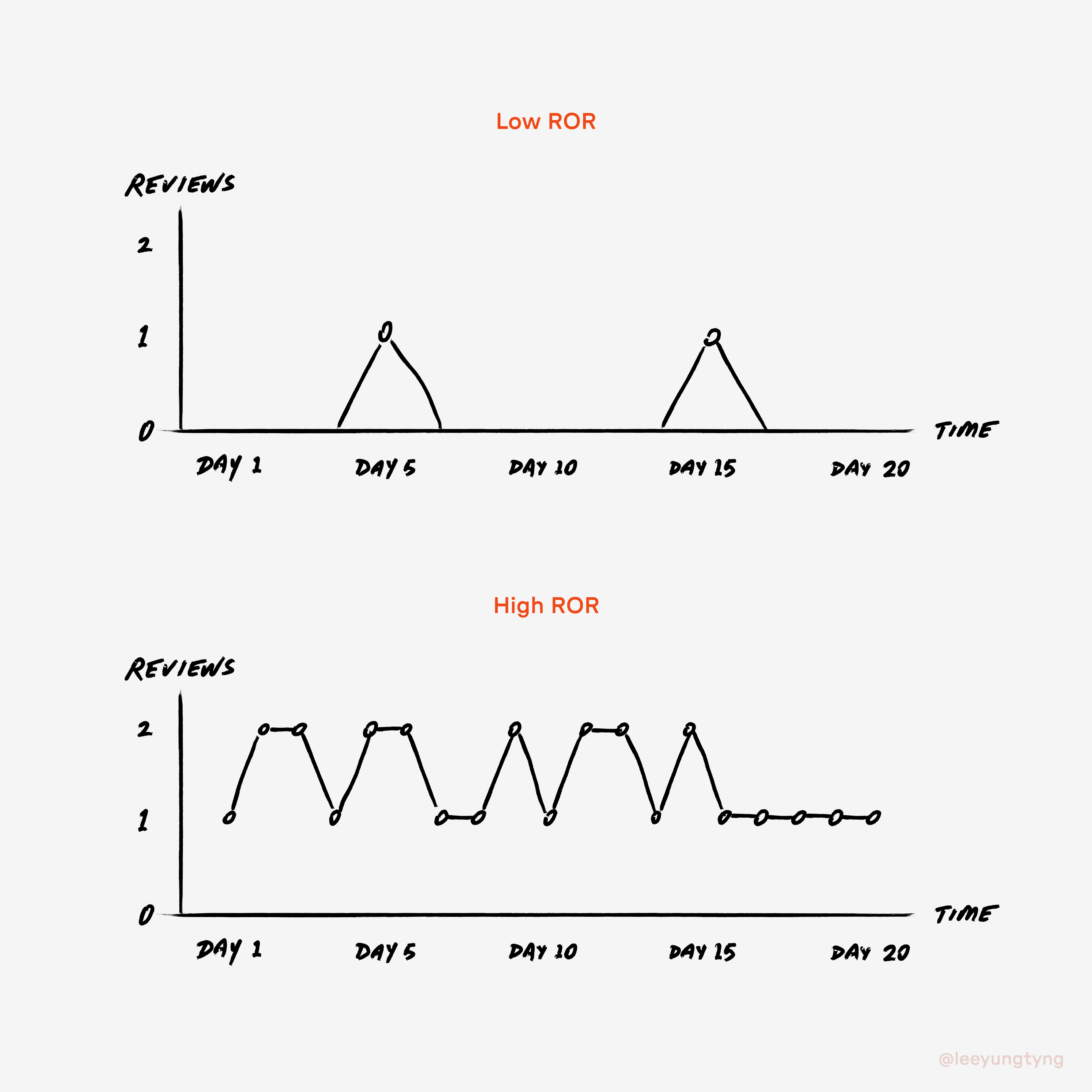
The reality: If nobody has seen your work at all until you show final prototypes, that’s a problem. You won’t get enough input for meaningful iteration, and you’re likely solving the wrong problem or missing obvious solutions.
The sweet spot: An ROR of 1–2 touchpoints per day feels both reasonable and manageable. You get focus blocks to do the work, and the team can see what you’ve done by end of day.
What low ROR (daily ROR of 0) indicates:
Working in isolation without feedback loops
Perfectionist tendencies that delay necessary conversations
Lack of shared understanding about project direction
5. Solution Variance Index (SVI)
What it measures: Solutions explored before first review divided by total iterations after stakeholder feedback.

The reality: I get frustrated in design peer reviews when I’m looking at someone’s singular solution and immediately ask, “Have you tried these four other possibilities?” If it’s not documented somewhere, it wasn’t really considered.
Andrew Chen’s Time to First Excuse (TFE) usually surfaces here. “I thought of it, but…”
High SVI (good): Explored multiple approaches early, minimal major changes after stakeholder input. Low SVI (problematic): First-idea syndrome leading to weeks of rework when someone inevitably asks, “What if we tried a completely different approach?”
What this reveals: Whether teams are doing actual design thinking (exploring trade-offs, considering alternatives) or just executing the first reasonable idea that comes to mind.
6. Comment Quality Ratio (CQR)
What it measures: The proportion of strategic feedback versus tactical fixes in design reviews.
The reality: When I work with a less experienced designer, my comments typically end up being “fix this spacing, this font is off, this component doesn’t follow our library” or “this flow would break feature X because of Y dependency.” These are basic issues—not just visual execution, but understanding how the broader product works. When I’m working with an experienced designer, the discussion becomes “How else could we achieve the same or better outcome?”
High CQR indicators:
Conversations about user impact and business outcomes
Questions about alternative approaches and trade-offs
Discussion of technical feasibility and implementation strategy
Low CQR indicators:
Focus on visual consistency and component usage
Basic interaction and accessibility fixes
Debates about spacing, typography, and colour choices
Why this matters: Comment quality reveals the actual design capability of your team. Good designers elevate the conversation. When your reviews end up more about having to fix execution details rather than strategic thinking, you’ve got a different problem than you think.
The Real Insight
These metrics point to something many teams miss: good design teams make everyone else’s job easier, but we hardly measure or recognise this.
Instead, we focus on design metrics in isolation—number of features designed (output over outcome), design system adoption, research insights—while ignoring whether our design work creates positive momentum across the entire product development cycle.
Engineers may have clear metrics because their deliverables integrate directly with the broader system. Design teams’ iterative cycles aren’t easily quantifiable, but their collaborative effectiveness absolutely is. When design teams operate well, you see it in smoother engineering cycles, fewer clarifying questions, and strategic conversations rather than tactical fixes. And maybe, just maybe, everyone enjoys working together.
The real question we should be asking isn’t “How productive are designers?” but “How does design work impact everyone else’s ability to do their job well?”
Not to worry—I don’t think these measures will materialise as Figma features anytime soon. In the meantime, it just boils down to personal standards, diligence, and internalising what people actually need from your work.
In other words: how to do your best work so it enables others on the team to do the same.
If someone somehow manages to implement these for real, please let me know. I’d be genuinely curious to see what comes of it. If you have your own examples, add them in the comments!